

Chairs, given their relatively limited range of function, are easily taken for granted. Despite this, it’s easy to know a good seat from a bad seat in terms of comfort and design. In normal daily life most of us are subjected to chair design that is ubiquitous and unexciting, but things weren’t always so banal. Obviously there is still contemporary chair design emerging that is both cutting edge, challenging and beautiful, but it has yet to filter down from concept and prototype to mass production (and IKEA). Here are some of our favourite designs of the late 20th Century, lauded for their innovation and provocation alike.
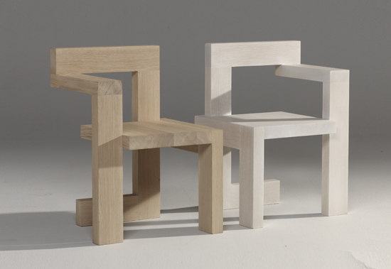
Steltman by Gerrit Rietveld, 1963.

Rietveld was a key figure in the De Stijl movement. His amalgam of intersecting horizontal and vertical forms is emblematic of the group’s utopian search for purity and unity in both art and society, to be accomplished through abstraction. However, such devotion to the sharp right angles means it doesn’t strike us as a chair to settle into for the evening.

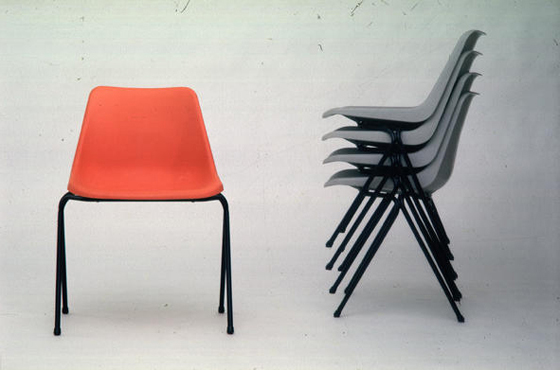
Polyprop by Robin Day, 1962-1963.

This causes us psychological more so than physical discomfort. Lauded for its low cost injection-moulding production technique, over 14 million units have been shifted since the 60s. Unfortunately, all it does is make us think of being crammed into Luce Hall or similar for three hours at a time, writing frantically and counting down the minutes until summer break.
Tube by Joe Colombo, 1969.

Getting onto this might be one thing, but managing to stay on these sloping, lacquered rollers — which can, admittedly quite ingeniously, be reconfigured into a number of formations as the sitter wishes — looks like a whole other challenge.
Chair-Sculpture by Allen Jones, 1969.

Although more sculpture than design, and despite perhaps looking comparatively more comfortable compared to other entries on this list, this piece doesn’t sit well with our morals. To go a step further, you might recognise this chair from the controversy sparked when Russian editor-in-chief of Garage, Dasha Zhukova, sat on a very similar design featuring a black mannequin for a photo shoot, raising questions over the sustained degrading objectification of black women by the fashion industry at large.
MAgriTTA by Roberto Sebastian Matta, 1970.

The fundamental question surrounding this three dimensional rendering of some of Surrealist René Magritte’s most often employed motifs is where does that stalk go in the process of sitting down?

Massolo (Porfido) by Piero Gilardi, 1974.
This slab looks anything but a nice place to sit and that’s the point. In fact, it epitomises Postmodern design with its mocking, tongue in cheek humour and it’s misleading materials — the form itself conjures up ideas of hard stone when it is in fact made of soft foam.
Pratone by Gruppo Strum, 1966.

We’re just not sure how.
Consumer’s Rest by Frank Schreiner, 1983.

A sardonic comment on consumer culture during the excess of the 80s, this design reminds us all too well of the pitiful Junior Freshman soul, waking up in the lift in Halls in a trolley from Tesco Rathmines.
Pylon by Tom Dixon, 1991.

Entirely handmade with thin steel rods we are suspicious of the load bearing capacity of this almost transparent piece. It is alleged, however, that this chair is structurally sound enough and more than capable of holding the weight of even the largest sitter. We’ll let somebody else try it first.